It is the world’s most favourite photo sharing app. It is owned by Facebook. It had a cool logo icon. There was no reason in the world to suddenly go for a change of icon and yet Instagram did it. The backlash level – becoming the joke of the town. Over the last week, I keep stumbling into online groups or articles that center around this incident. Internet is filled with memes and jokes about the Instagram icon change. Although the “Universe may never care” this insignificant design change was blown out of proportion in the social media world. Quite frankly, the fact that the new icon is an unbelievable mess of pink and orange and violet doesn’t help. The warm colours of the logo didn’t help either in the worst heatwaves over the years. Its 49 degrees here folks!
Forgetting The Cardinal Rule Of Design
When you design something, you make sure that it lasts. One rule that applies to any good design is that it is only good if it can be changed easily. Consequently, a good design is something that you don’t have to change too frequently. If the design is good then you don’t need to change it. More succinctly put- “Don’t fix what ain’t broke”. Instagram probably forgot that. I can understand why they would be desperate to change their icon but I can’t understand the leap from an unique identity to a minimalist caricature which seems like a work of a 6 year old at best.
Logical Step Forward, Not Blind Minimalism
Well since it is now a matter of debate, I can come out and safely voice my opinion about being minimal. There is a whole minimalist movement in the creative industry and the designers are expected to strip down their designs to conform to the latest trends. However, Instagram’s efforts at that could be considered a misstep since it completely rejected a perfectly cool logo. In the world of minimal icons, Instagram’s was a bit different. Its vintage camera look reminded us of the basic value of the app and we never confused it with other icons like the phone camera or any other photography app. One inherent risk of going minimal is going generic. I feel that’s what the new icon looks like. Where is the next logical step in the evolution of the logo?
People Vs Instagram
I can’t wrap my head around the fact that being a “social” app, Instagram never cared to reach out to its users for a poll or a design contest.
Before the reactions started coming in last week about the new logo of Instagram, I found two distinct issues about the logo. Firstly, I couldn’t find it on my phone a couple of times. Usually logo changes are not as drastic and even when new icons are updated, I still manage to find enough resemblances to not overlook an app. Secondly, I just hated it. First one I can get used to but second one is a perception that will last. I can’t wrap my head around the fact that being a “social” app, Instagram it never cared to reach out to its users for a poll or a design contest. It is understandable if it is your first logo, but if you are the world’s most popular app, I think you’re ignoring a lot of potentially cool designs here. So when the barrage of memes hit the internet, its justified.
What Could Have Been
How To Fix It Now That You’ve Broken It
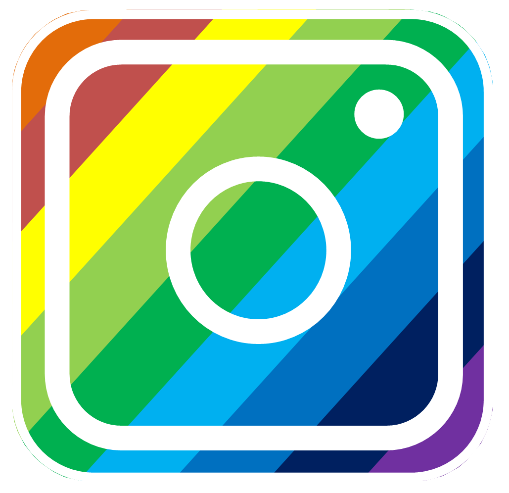
Going back to the old design is not an option. Neither is getting a new logo since it takes huge efforts to change the identity. It is not a good branding decision to frequently change logos. All you can do once you’ve taken this step and failed is to just go with it. In time people will get accustomed. All you can do is to ride the wave. If there’s a possibility to work around the current logo then a small transformation may be done to the logo. For Instance:
It took me 5 minutes to create this version of the logo which takes the little colourful bar on the old camera icon and the new design’s gradient colours and merges them. Hope someone from Instagram will pick it up for the next version.

